Up early this morning. Like 2:30am early. Still getting my retirement clock set.
I'm seeing that image size on the web is more than inches or pixels. The same 4 inch image can look very different, depending on pixels per inch.
The part I was missing is the resolution of the final screen. In the original Macintosh, the screen had 72 pixels per inch. This conformed to the typographer's measure of 72 points per inch. If type was 72 points, it was one inch tall. That worked well when the screen was limited to 512x384 square pixels. An inch was an inch.
As screens evolved and grew larger, pixel density went up. We view web pages on a variety of screen types; computers, phones, iPads and more. Designing for a fixed screen size at a fixed resolution is no longer effective. Apple Retina displays have resolutions of 218, 227, 326, 401, 458 pixels per inch or more and use screen 4 pixels to display 1 'dot' of your image. You can see that correlating pixels to inches no longer works. I'm currently working on a 27" iMac with a Retina display: 5120 x 2880 pixels, 218 pixels per inch.
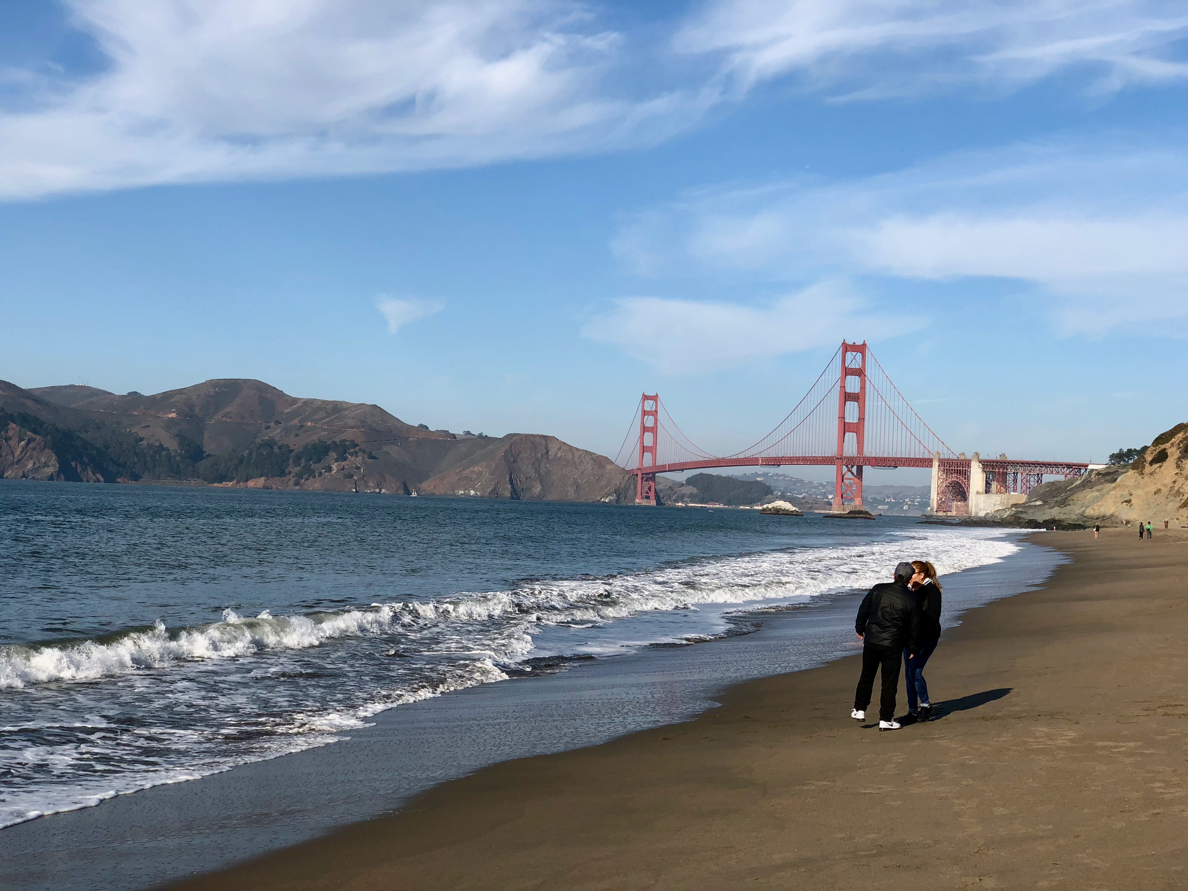
Below are two examples of reducing an iPhone image that started out as 4032x3024. The original image is too large to see on a web page and is 2.2MB. I wanted to constrain the image area and reduce the file size.
In these examples I'll take the same image and reduce it in size to 4 inches. The original image is 3032x3024 pixels at 72pixels per inch. Click on the smaller image to see the original. Your browser may constrain the image to its window. Scroll of click again to see full size.
In the first example, I resized the image to 4x3 inches at 72 pixels per inch. If you have a monitor that resolves 72ppi, the image would be 4 inches by 3 inches. Most modern monitors have greater resolution so the image appears smaller than 4 inches across.
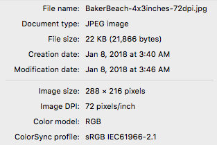
Baker Beach reduced to 4x3 inches at 72dpi.
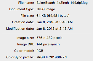
In the the next example, I resized the image to 4x3 inches at 144 pixels per inch. If you have a monitor that resolves 144ppi, the image would be 4 inches by 3 inches. Most modern monitors have greater resolution so the image appears smaller than 4 inches across. You can see that as more pixels per inch are saved, the file size becomes larger.
Baker Beach reduced to 4x3 inches at 144dpi. That's 576x432 pixels.
Why not just put pictures up at their camera resolution? Because cameras have very high resolution sensors, posting a picture at its native resolution would make the image much larger than the browser window. The clip below is posted at the camera's native resolution. Not only is the full size file too big to fit in the window, the file itself is about 5 times the size, making downloading images much slower. You can see the full size image by clicking on the first sample and letting your browser view the file.
A
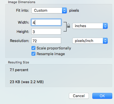
In these examples I used Apple's Preview tool to resize the image file. The file info box is very helpful to determine the final image size.
There are many references and discussions about the 'right' way to create and size images for a web page:
| Back to January 07 | January 08, 2018 - rudy@rugebregt.com | On to January 09 |